Link to FINAL FILEFRONT
Link to DRAFT THREE FILEFRONT
Monday, October 22, 2007
Final Image Captures and Architecture
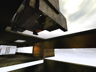
Overall Perspective:
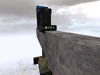

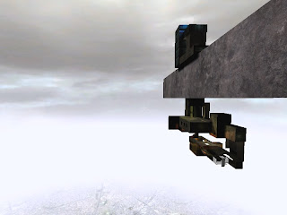
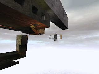
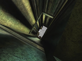
Elevator Pathways:
The Meeting Point and Dining Table:
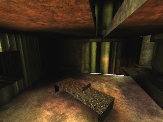
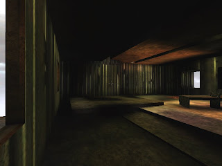
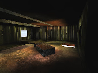
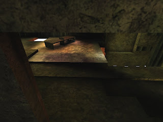
I attempted to form an extremely atmospheric private room in which the two business people could not only retire comfortably away from their working offices, but discuss matters intelligently. I believe this room creates a powerful and influential ambience through the dark lighting focusing on the dining table as well as the carefully selected windows and opening, creating an impression on the users of the room and reminding them of the power they possess.
Office One (Zhang Ying):


As depicted through the previous images, I attempted to design a space for Zhang Yin in which she could philisophically reflect on her inner power created as a result of the difficult and crucial decisions she had to make as well as the hardships she overcame. I think the ambience I created through a simple yet well articulated structure and deep lighting really evokes a sense of triumph and future possibility.
Office Two (Ratan Tata):
The office space I created for Ratan Tata is not particularly conventional due to its large openings and colour tones, however I really wanted to convey a sense of personal belief and 'inner power' so as to reflect decisions Tata made which were not the general consensus, but what he believed to be right. I think the oversized opening and side rooms fulfill this, creating an atmosphere of change and difference.


Elevator Pathways:


The Meeting Point and Dining Table:


I attempted to form an extremely atmospheric private room in which the two business people could not only retire comfortably away from their working offices, but discuss matters intelligently. I believe this room creates a powerful and influential ambience through the dark lighting focusing on the dining table as well as the carefully selected windows and opening, creating an impression on the users of the room and reminding them of the power they possess.
Office One (Zhang Ying):


As depicted through the previous images, I attempted to design a space for Zhang Yin in which she could philisophically reflect on her inner power created as a result of the difficult and crucial decisions she had to make as well as the hardships she overcame. I think the ambience I created through a simple yet well articulated structure and deep lighting really evokes a sense of triumph and future possibility.
Office Two (Ratan Tata):


The office space I created for Ratan Tata is not particularly conventional due to its large openings and colour tones, however I really wanted to convey a sense of personal belief and 'inner power' so as to reflect decisions Tata made which were not the general consensus, but what he believed to be right. I think the oversized opening and side rooms fulfill this, creating an atmosphere of change and difference.
Sunday, October 21, 2007
Dining Table Design and Animation

*** My previous attempts at a dining table animatiion have been slightly too complicated, fast paced and unclear. I therefore realised how important it is for me to really limit the information I attempt to portray through the animation in order to make it more effective ***
Final Development of Dining Table within UT2004:
I really want to portray the dining table as the 'soul' of my overall design, representing the inner power and strength of clients with a glowing, bold, strong design.
Final DRAFT:
After creating this animation, I found that it doesn't completely effectively highlight my dining table for a couple of reasons. Firstly, I think that I have tried to show too much too quickly in the allocated time frame allowed, therefore making the animation a bit confusing and busy, ultimately taking away from the dining table design. Further, I think I have allowed too much fog in each frame of the animation, making the design slightly unclear.
Final Animation:
I am really happy with this final animation. I think it shows off the dining table extremely clearly without attempting to show every single side of it, which took a lot of trial and error in order to limit what I wanted to display. The movements of the animation highlight the dining tables best and most interesting angles as well as revealing them long enough for the viewer to absorb it instead of bouncing around the entire design. Visually, I think it is quite subtle and light yet also leaves some powerful images, creating quite an interesting representation of the clients inner power and strength through a dining table's design.
Elevator Design and Animation


*** My previous attempts at visually highlighting the movement and pathways of the elevators I have included within my design have seemed to be a bit unclear as well as not particularly stimulating to watch, this is therefore what I think I really need to improve on ***
Final Development of Elevator Pathways within UT2004:
I had not fully considered the degree to which the elevator movements within Unreal added to my overall design, however, in this final week of design development I really capitalised on this possibility in order to fully develop my design concept.
Final Draft Animation:
I have really attempted to highlight the various elevator pathways I have created within my design in a way that was not only visually interesting, but highlighted the distinct way I have approached the representation of Power. By beginning the animation with the basic office/meeting space design without the elevator pathways, I wanted to reveal the often fleeting nature of power. However, with the two different elevator pathways gradually being added, I also attempted to highlight the diverse and complex characteristics that achieving 'power' can induce.
I like the overall look and concept behind this animation, although it is clearly too long and I therefore need to develop it further.
Final Animation:
I have clearly found it extremely difficult to limit my animation to 10 seconds, despite cutting out various scenes. I think this is due to really wanting to give an accurate representation of the different pathways of the elevators that make up my design.
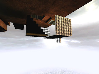
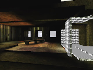
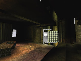
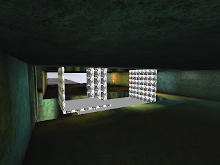
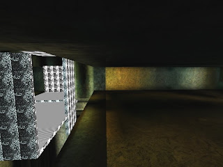
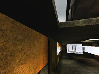
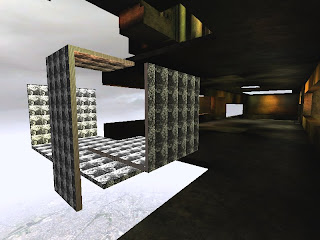
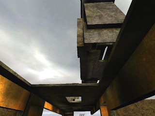
Texture Application within the Design.
*** I have been advised to really limit my usage of textures within the design due to it often taking away from my actual design ***
Therefore I tried really hard to only use a certain number of textures which were a similar tone so as to add to the overall design, yet not take away from it.
Also, I really like the degree of visual complexity added to a design by the use of textures, so I really didn't want to lose this from my designs.
For example, the following images highlight the way I believe I have successfully carefully limited the application of Unreal textures so as to emphasise the architecture, angles and light rather then take away from them.


Design Development of Offices + Meeting Place
The following is an explanation of my consideration of POWER behind the design of Zhang Ying and Ratan Tata's offices, as well as their meeting point.
Office One: Zhang Ying
* Crucial decisions - A large crevice in the centre of the office whenever the elevator moves away.
* The 'unknown' within business, personal courage and inner power - Quite dark, moody lighting.
* Open ended possibilities - open end of office.
Meeting Point
* Endless possibilities for future power and development as well as personal inner- restrictions - Various openings and enclosed sections of the meeting point.
* One's natural inner power and personal 'nature' in terms of using and developing their power - Use of rock and brown/green tones.
* A different perspective in order to achieve unprecedented power - Angled dining table.
Office Two: Ratan Tata
* The 'ins and outs' of opinions, comments and other peoples beliefs - Open plan with large windows with a central path for Tata's own direction and decisions.
* No general consensus of ideas, only one ultimate way with 'light at the end of the tunnel' - side rooms.
Tuesday, October 16, 2007


Dining Table Placement
I have considered where is best to add the dining table, creating a space functioning for comort whilst one is not working, yet also allowing for sophisticated discussions and decision making. I therefore thought that the straight-forward yet strong design of the table would work within the actual meeting point of the design, ultimately being the 'soul' of the design, repesenting the inner power and strength achieved by each entrepeneaur.
Elevator Pathways
I have decided to create a more comprehensive elevator pathway, so as to take the viewer on more of a journey rather then just aiming toward one specific destination.
I do not want to overcomplicate the design, and I feel that a complex pathway will take away from the elevator and offices themselves. Therefcre I am going to modify the elevator pathway by adding another elevator, with one starting from each office.
Power is an idea, constantly changing...possibly fleeting, a desire. These ideas are going to inform my elevators movements by being quite simple, yet moving infront and behind of the offices before moving directly to the meeting point so as to highlight the inner power they have achieved as reflected through their intricately designed office spaces.
Developed Elevator
I have considered the shape and design of my elevator extensively, and have made some minor alterations which should make my elevator fit more coherently with my overall design.
I believe that the current shape of the elevator satisfies what I would like it to add to the design and do not think that a radical change to its shape would dramatically add to the spaces I have created . I modified some of the edges of the elevator so as to be more reflective of the dining table design, with some of the edges coming to a point. This makes its design less intense and dominant, due to the edges not being a particularly dominant feature, simplifying the design.
After experimentation, I have also decided to leave the elevator design as is because I really like how it is half open, half relatively closed off, often reflective of personal discussions in business.
I wanted the elevator to be quite graphic and intense so as to reflect the intensity and difficulties of high-stake businesses as well as to highlight the power of development, moving 'forward' and personal transformation. I have further attempted to exaggerate this concept by applying a quite organic yet graphic texture to the elevator.
Concept/Design Development after Crit.
Issues to consider:
a) Develop elevator shape
b) Modify pathways of the elevator for more of a journey rather then purely a destination.
c) Make sure elevator moves
d) Develop dining table placement in meeting place
e) Simplify texture use
a) Develop elevator shape
b) Modify pathways of the elevator for more of a journey rather then purely a destination.
c) Make sure elevator moves
d) Develop dining table placement in meeting place
e) Simplify texture use
Tuesday, October 9, 2007
Tip/Trick
Try add lighting to the unreal space quite slowly, rebuilding it often, as too much light can look quite glary and intense, taking away from the design.
Saturday, October 6, 2007


Subscribe to:
Posts (Atom)
